PROTEUS — PRACTICE
Visualizations to Aid Interpretation: Chapter 10
In this excerpt (Chapter 10) from the PROTEUS-Practice Guide, you’ll find recommendations on graphically displaying patient-reported outcome measure (PROM) data to promote patient and provider understanding and use.
This webpage contains the entire contents of Chapter 10. You can also download the PROTEUS-Practice Guide by clicking here.
To learn more about displaying PRO results from clinical trials, please visit “Displaying Results” in PROTEUS-Trials.
Key Points
- Optimizing patient-reported outcome measure (PROM) visualization can help patients and providers interpret PROM results with greater ease and accuracy
- Numerous graphical approaches for visualizing PROM data exist, and the selection of an approach should depend upon the purpose of the visualization and the context in which the PROM information is being used
- Information such as score directionality, meaning, and possibly concerning results can be effectively conveyed through visual cues
- Color, bolding, symbols, and hover-over text can be used to meaningfully draw attention to aspects of the PROM data display
- Including supplemental information such as clinical data about the patient or practice guidelines in the PROM visualization can help contextualize PROM results
Overview
For PROM data to be useful in clinical care it must be understood by providers and patients. PROM results can be presented in several different formats. They can be presented numerically, through text and tables, or visually, through charts, pictographs, and other graphics. While visual formats are typically more intuitive and enhance appropriate interpretation, they are also more challenging and costly to design and integrate, especially into EHRs.
As users increasingly access results with their mobile devices, visualizations should be designed for optimal use on both computer and mobile device screens. Formats readable by screen readers make PROM results accessible to patients with visual limitations.
PROM results can be displayed at varying levels of complexity. Simple displays may describe PRO scores in a static format. Complex displays can be more interactive, and include functionalities such as representing change scores, comparing individual PRO scores to population PRO scores, and incorporating other forms of benchmarking.
There are different methods to improve the ease and accuracy with which PROM data is interpreted. The selection of a particular visualization approach for PROM data should depend upon the purpose of visualization, and the context in which the PROM information is being used (i.e. for a patient encounter vs. analytic/research purposes). Optimal approaches for displaying individual-patient level data are line graphs of scores over time, which can be supplemented with features such as arrows and descriptive text to better convey the results. Other visualization approaches include bar graphs, tables, color bars, pictographs, scatterplots, pie charts, and floating column bars, though many of these are better suited to group-level data. Many of these methods are appropriate for comparisons across groups or to reference values.
Different types of information can be included in and alongside a display of PROM results, such as score directionality (i.e. whether higher scores are better or worse), descriptive labels indicating score meaning and/or severity thresholds, scores that are possibly concerning, and indications of clinically important changes. Visual cues, such as lines, color and shading, symbols and pictures, bolding/highlighting/arrows, and hover-over text/annotation, can draw attention to specific aspects of the PROM data display.
PROM data can be organized in various ways within the display window depending on the functionalities of the PRO system or the electronic system within which it is embedded. These options include presenting visuals of PROM results in separate tabs, within the same window, in a dashboard, or overlaying PROM results onto one graphic. Display windows can also be organized to include supplemental information that can help contextualize PROM scores, such as clinical information about the patient or practice guidelines.
Questions and Considerations
A. What are different ways to display the data?
Numeric
- Presented in text or tables
- Can be relatively easy to configure, including in electronic health records and patient portals
- Does not require data manipulation
- Reflects format for clinical results care teams are already accustomed to reviewing
- May make it difficult to quickly identify problematic results or significant changes if only numbers are presented
Visual/graphical presentation
- Includes charts, graphs, and pictographs
- Can be more intuitive and promote accurate interpretation of the data
- May be preferred for displaying information about changes in health
- Can more effectively communicate health to low literacy groups with specific visualization methods, such as pictographs
- May be harder to integrate into electronic health records
Simple displays
- Lack contextual details
- Typically static and require no user interaction
- Easier and less expensive to develop
- May be easier to interpret by both patients and clinicians
- Can lead to potentially inaccurate interpretation due to less detail provided
Complex displays
- May include descriptive text (possibly personalized), change scores, comparisons to population values, and other forms of benchmarking
- Increase ability to contextualize PRO scores and use them to inform care decisions
- Require more resources to develop/maintain and more energy to interpret due to their sophistication
B. What graphics are appropriate for visualizing different types of PROM results?
Below is a figure describing different types of graphs that can be used to visualize individual-level PRO data with examples.
Figure 10.1: Graph types to visualize PROM results
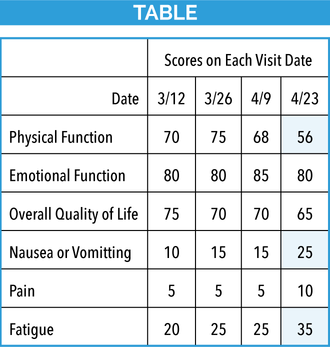
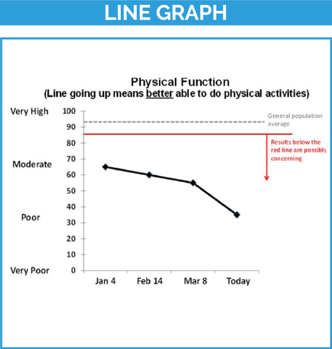
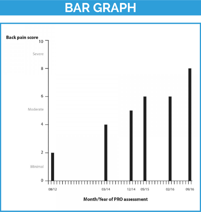
Adapted from ePROS in Clinical Care website and from Recommendations for PRO Data Display
C. What information can be included in visuals to aid PROM interpretation?
Directionality of PROM scores
- Indicate the directionality of PROM scores clearly to improve the interpretation of their meaning. Depending on the specific PROM, improvement in health outcomes might be a numeric increase or decrease in score
- Avoid mixing score directions within a specific display
- Use labels, titles, and other annotations to make clear which scores indicate “better” and which indicate “worse” scores on the PROM
Score meaning / Severity thresholds
- Include descriptive labels and/or color-code (e.g. mild, moderate, severe) on graphs when there is data to support their placement; anchors at the extremes (e.g. none, severe) can be used even if information on the middle categories (e.g. mild, moderate) are not available
- Select PROMs that have validated severity thresholds, if available
- Use PRO-bookmarking, Rasch measurement theory, anchor-based methods, and other approaches to identify severity thresholds, if not available for a given PROM
Possibly concerning results
- Possibly concerning results can be generated either from absolute scores, or from changes in scores over time
- Possibly concerning PRO results can often be displayed in a manner consistent with how other concerning results (such as for biomedical data like blood tests) are displayed
- Examples of possibly concerning results include scores outside of a target range, or scores that require attention or intervention by the medical team
D. What visual cues can be used to enhance key information in PROM visualizations?
Lines on the graph
- Can be used to visualize discrimination of scores (e.g. lines can indicate the threshold for mild, moderate, severe scores)
- Can be used to visualize a clinical cut-off, e.g. cut-off scores for a psychological screening
- Can be used to reflect reference values such as those from the general population or another comparator group
Color and shading
- Traffic light colors (green, yellow, red) can be used to designate severity
- Pairings of color and shading should consider the needs of people with visual impairments such as color blindness/color confusion
- Cultural associations of patient populations should be considered when relevant as colors have different meanings in different cultures
Symbols and pictures
- Pictures/symbols can be used to make results more interpretable
Bolding/highlighting/text size/arrows
- Can be used to draw attention to a particular aspect of the visual
Hover-over text/annotation
- Can provide description or definition of key terms within the graphic
E. What different ways can PROM data displays be organized?
- Tabs: present different PROM results in different tabs. Tab systems require toggling between different screens and can make it more challenging to compare results across different PROMs and more difficult to manage on mobile devices
- Dashboards: present different PROM results, often each using different graphical styles
- Overlay of multiple PROM results on the same graphic: makes it easier to observe symptom clustering
- Not all systems may have the ability to offer all displays
- There is a tradeoff in selecting any given option for presenting PROM scores. For instance, dashboards may be easy to use but are challenging to design and integrate
F. What additional information can be included alongside visualizations to improve interpretability of PROM data?
- Contextual information can provide a more holistic view of the patient’s health. Examples of this information include interventions received, demographic information, lifestyle information, medical events, and vital signs
- Practice guidelines can be provided alongside PROM data to inform decision-making
Relevant Primary Resources
The information presented here is an overview of aiding interpretation of PROM results. For more detailed information please see the following sources:
Background And Citing The Proteus-Practice Guide
Nothing in this Guide should be construed to represent or warrant that persons using this Guide have complied with all applicable laws and regulations. All individuals and organizations using this template have the responsibility for complying with the applicable laws and regulations or regulatory requirements for the relevant jurisdiction.
Each chapter of the Guide lists the key foundational resources that informed its content. To appropriately recognize the foundational resources, we encourage you to cite both the Guide and the relevant foundational resource(s). Recommended citations are provided here.
Suggested Citation
The PROTEUS Guide to Implementing Patient-reported Outcomes in Clinical Practice
A synthesis of resources. Prepared by Crossnohere N, Brundage M, Snyder C, and the Advisory Group, 2023. Available at: TheProteusConsortium.org.
Further Reading
The Guide draws primarily from the foundational resources cited in each chapter. Please click here to find a selection of other relevant references.